


Shortly after starting at Redbox, it became abundantly clear that in the face of declining DVD sales and competition from rising industry newcomers, we had to modernize and streamline the company's online properties. A ground up redesign of the Redbox digital experience was undertaken, bringing a fully responsive redesign, striking new visual language, checkout enhancements, and mobile app redesigns to life in just under a year.
Role: User Experience, Art Direction, Design
Our work began by understanding the users' journey from idea through purchase and pickup, charting their emotional state against brand engagement along the way. Areas of overlap allowed us to identify opportunities for innovation.
Checkout was quickly identified as a pain point for our users, resulting in lost opportunities for conversion and positive brand association. Using the existing checkout architecture, we optimized user flows and screen layouts to reduce abandonment.
The resulting updates oriented users and clarified information relevant to purchase.
Throughout the process, opportunities for incremental revenue were created through promotional add-ons and personalized recommendations.
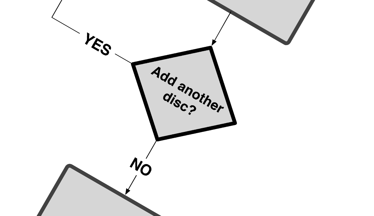
Thoroughly detailed wireframes allowed us to document our decisions as they related to user flows and product functionality. Conditions and error messaging were also explored to ensure our system flexed appropriately in response to varying use cases.
After validation of our cart designs via user testing, we cascaded the design language across the site to reduce browsing time for users, make choice architecture easier to navigate, and portray the overall redbox brand as tech-forward company that understood its customers.
The release of iOS 7 brought an opportunity to extend our thinking to apple's entire mobile platform. Using native patterns to create a seamless experience, we employed a high contrast color palette, clean typography focused on content over style, and layout optimizations that made the entire experience intuitive as well as beautiful.
Custom icons added a personalized touch to the product by conveying the brand's approachable personality without sacrificing clarity and recognition.
Traversing multiple platforms and native pattern architectures, our design language held up due to its simplicity, focus on clarity of information, and consistency across touch points.
The redbox logo even got its own mobile extension, keeping the classic character of the full logo but optimized to pack the same brand punch on smaller screens.